The settings described on this page are located in the ComfyUI in-app settings menu. You can open it by navigating to Settings (gear icon) or using the
Ctrl + , keyboard shortcut, then select the corresponding category to view and configure these options.Color Palette System
The primary way to customize ComfyUI’s appearance is through the built-in color palette system.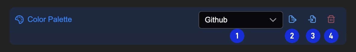
- Switch ComfyUI themes
- Export the currently selected theme as JSON format
- Load custom theme configuration from JSON file
- Delete custom theme configuration
For appearance needs that cannot be satisfied by the color palette, you can perform advanced appearance customization through the user.css file
How to Customize Color Themes
The color palette allows you to modify many specific properties. Here are some of the most commonly customized elements, with colors represented in hexadecimal format:Canvas
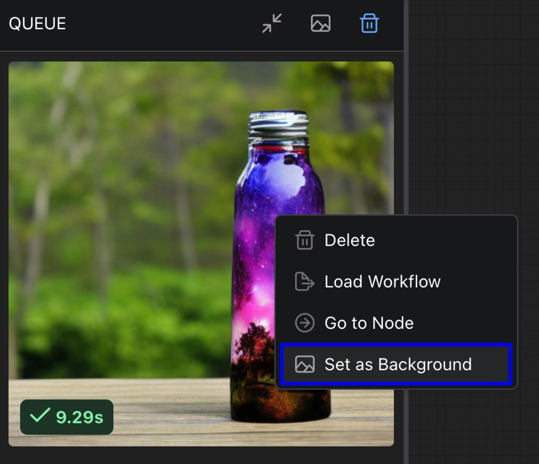
Background Image
- Requirements: ComfyUI frontend version 1.20.5 or newer
- Function: Set a custom background image for the canvas to provide a more personalized workspace. You can upload images or use web images to set the background for the canvas.
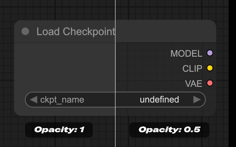
Node
Node Opacity
- Function: Set the opacity of nodes, where 0 represents completely transparent and 1 represents completely opaque.
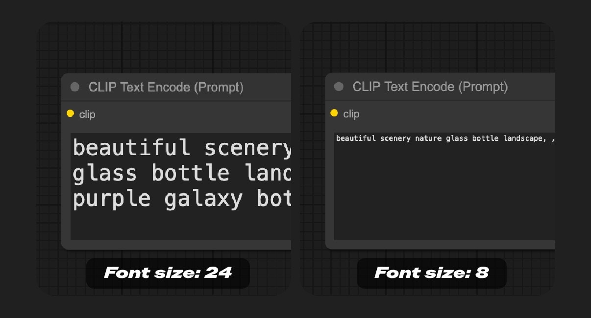
Node Widget
Textarea Widget Font Size
- Range: 8 - 24
- Function: Set the font size in textarea widgets. Adjusts the text display size in text input boxes to improve readability.
Sidebar
Unified Sidebar Width
- Function: When enabled, the sidebar width will be unified to a consistent width when switching between different sidebars. If disabled, different sidebars can maintain their custom widths when switching.
Sidebar Size
- Function: Control the size of the sidebar, can be set to normal or small.
Sidebar Location
- Function: Control whether the sidebar is displayed on the left or right side of the interface, allowing users to adjust the sidebar position according to their usage habits.
Sidebar Style
- Function: Control the visual style of the sidebar. Options include:
- Connected: The sidebar appears connected to the edge of the interface.
- Floating: The sidebar appears as a floating panel with visual separation from the interface edge.

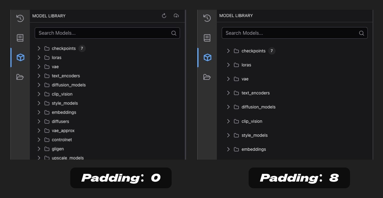
Tree Explorer
Tree Explorer Item Padding
- Function: Set the padding of items in the tree explorer (sidebar panel), adjusting the spacing between items in the tree structure.
Advanced Customization with user.css
For cases where the color palette doesn’t provide enough control, you can use custom CSS via a user.css file. This method is recommended for advanced users who need to customize elements that aren’t available in the color palette system.Requirements
- ComfyUI frontend version 1.20.5 or newer
Setting Up user.css
- Create a file named
user.cssin your ComfyUI user directory (same location as your workflows and settings - see location details below) - Add your custom CSS rules to this file
- Restart ComfyUI or refresh the page to apply changes
User Directory Location
The ComfyUI user directory is where your personal settings, workflows, and customizations are stored. The location depends on your installation type:- Desktop - Windows
- Desktop - macOS
- Desktop - Linux
- Manual Install
- Portable
ComfyUI/user/default, then restart ComfyUI or refresh the page to apply changes.
user.css Examples and Related Instructions
Theuser.css file is loaded early in the application startup process. So you may need to use !important in your CSS rules to ensure they override the default styles.
user.css Customization Examples
- Start with the color palette for most customizations
- Use user.css only when necessary for elements not covered by the color palette
- Export your theme before making significant changes so you can revert if needed
- Share your themes with the community to inspire others
- If your color palette changes don’t appear, try refreshing the page
- If CSS customizations don’t work, check that you’re using frontend version 1.20.5+
- Try adding
!importantto user.css rules that aren’t being applied - Keep backups of your customizations to easily restore them